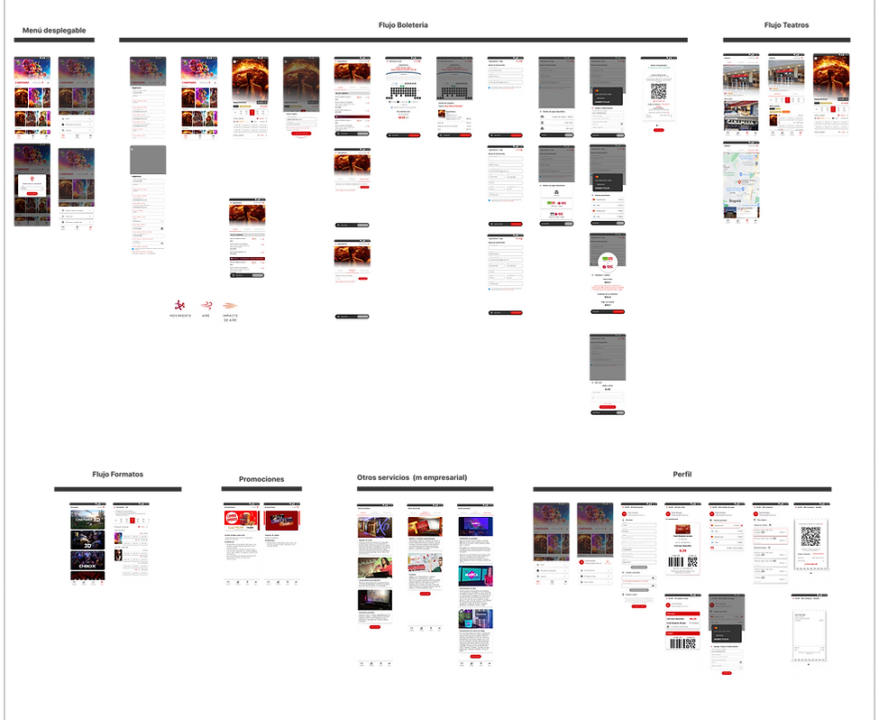
During the redesign of the product experience for Cinemark's mobile applications, I developed and implemented a comprehensive Design System. This system provided a cohesive and standardized set of design principles, color palette, typography, interface components, and interaction patterns. The Design System was designed to be easily adaptable to different platforms (Android and iOS) and markets, and it served as a centralized resource to ensure visual and functional consistency across all Cinemark applications. This allowed for more efficient development and a consistent and appealing user experience across all markets and platforms.

Focus on Simplicity
The redesign focused on reducing visual weight and emphasizing simplicity.
Minimalist Approach
White was used as the dominant color to create a clean and calm environment for users.
Strategic Use of Color
Red was minimized to prevent visual fatigue and used only for key interactions
User Experience
The redesign improved aesthetics and functionality, offering a more comfortable and appealing user experience.
Grid
To begin the redesign of the application, it was essential to ensure easy scalability. For this, a grid system was required that would allow for an organized distribution of objects on the screen and adhere to current standards competition. I implemented a "pixel-perfect" design approach with an 8px baseline grid and auxiliary guides at 4px and 2px intervals. This level of design precision allowed us to ensure meticulous visual consistency across all user interface components. This meticulous design system helped maintain aesthetics and functionality in every detail, guaranteeing a harmonious and visually appealing user experience, regardless of the market or platform

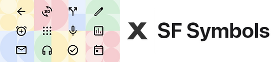
Recognition and iconography
For the iconography, we carefully chose to use Material Icons for Flutter, which allowed us to maintain a consistent design language across the application and significantly simplify the development process. By leveraging this standardized icon set, we ensured that the user interface remained cohesive and intuitive. Additionally, to cater to both Android and iOS users, we incorporated SF Symbols. This decision was aimed at providing a seamless and familiar experience for users on both platforms, ensuring they could easily recognize and interact with features they are already accustomed to. This dual approach helped enhance cross-platform usability while maintaining visual and functional consistency
Iconography
For the redesign project of Cinemark's mobile applications, I made the decision to use standardized icon libraries to ensure a consistent and professional appearance across all platforms. For the Flutter version, we employed the Material Design icon library, widely recognized for its extensive collection of high-quality icons and easy integration with Flutter.
For the iOS version, we turned to San Francisco Symbols, an icon library provided by Apple, which seamlessly integrates with the native iOS design and provides an authentic and consistent user experience for Apple users.
These libraries provided icons that are not only visually appealing but also intuitive for the users, enhancing the usability and overall user experience in Cinemark's applications

After Before
Tipography
During the redesign process of Cinemark's mobile applications, we chose to use the Work Sans typography, which was already in use by Cinemark USA. The main objective of this decision was to establish design consistency between Cinemark USA and Cinemark Latin America.The choice of Work Sans aimed to unify the branding across all platforms and markets, maintaining a consistent and continuous visual appearance. This typography, known for its readability and modern aesthetics, reinforced the brand identity and improved the user experience, allowing for easy identification and association with the Cinemark brand in all countries.

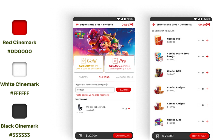
Palette
In the redesign of Cinemark's mobile applications, we made strategic use of the color palette to enhance the user experience and reinforce the brand identity. We opted to use Cinemark's characteristic colors: white, red, and black.
The use of white and black provided a clean and timeless color scheme that reinforces Cinemark's identity. As for the color red, despite its negative connotation in some design contexts, we used it strategically as a signal for the interactions we desired from the user.
Use of image
In order to polish the aesthetics and decrease the visual weight of the application, I implemented a design strategy focused on the optimized use of images. We took advantage of the cinematic aesthetic to enrich the user's visual experience.
In the confectionery section, we eliminated the use of backgrounds to reduce visual saturation and increase the appeal of the products. Similarly, in the movie banners, we sought to incorporate the aesthetics of movie posters to improve visual cohesion and attract the user.

Mvp
I redesigned the Cinemark app by optimizing the checkout flow. I reduced the process from 12 to 7 screens using a functional palette (red for key actions) and a cleaner design with lightweight assets. I seamlessly integrated memberships into the purchase journey and designed with Flutter-native components for faster development. The result is a more intuitive and efficient user experience.